 I got real excited when I heard about Staples new line of environmentally friendly composition books, legal pads and loose-leaf filler paper, made of pulped bamboo waste. My eyes drifted to the kitchen window with its view of an acre of formerly ornamental bamboo growing wild in the ravine behind our house. Could paper products be the answer to our prayers? My mind was filled with the idea of selling the invasive crop to a paper factory to be ground up and turned into cheap, fountain-pen friendly paper! Maybe we could finally build that deck over the ravine without fear that it would be swallowed up by 20-foot tall stalks that look like they came straight out of Day of the Trifids.
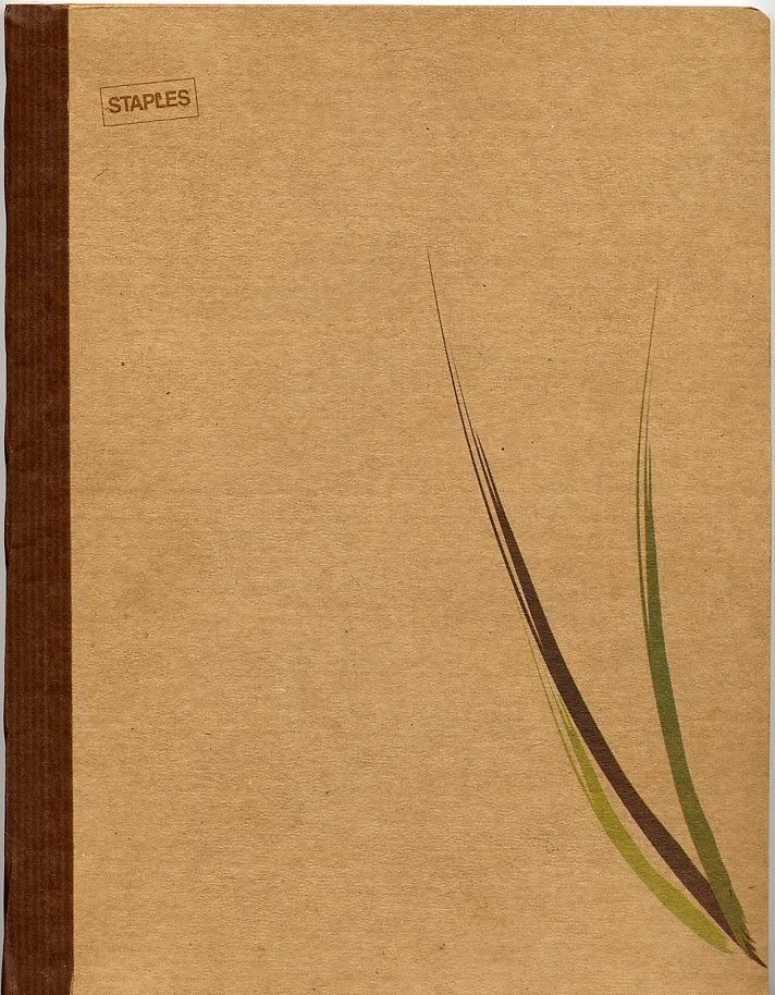
Alas, I found out the eco-easy line is not made from bamboo waste, but pulped sugar cane (bagasse) waste. Hell, another opportunity blown. I can’t even get the panda keepers at the zoo interested in our bamboo crop. It’s the wrong kind of bamboo.
However, I degress. The fact is, I went to Staples and picked up one of the $2.49 eco-easy composition notebooks, and I’m impressed with its quality. This inexpensive paper is not what you want to use to write a letter to your grandmother thanking her for gifting you the family heirloom silver. It doesn’t have the archival properties to use for writing that you want to keep for a long time, such as a journal. However, for every day use as a project notebook or to keep on the desk to jot down notes, this cheap, fountain pen friendly, paper may be just about perfect.
The Cover: I’m not a fan of the junior high school composition books with those black and white marbled covers and the wide spaced lines. The cover of the eco-easy composition books is heavy, rough, brown stock. The thick fibers in the card stock give it a nice texture. Overall, it has a plain-brown-paper wrapper sense of efficiency. The covers come in several simple designs, which do not detract from the sturdy, functional look. I picked a notebook with a with a single flowing light green leaf of a sugar cane. The cardstock covers are stiff enough to make the notebook usable hand-held or balanced on your knee. The 100 pages are stitched into the cover. In a pinch, you can fold paper and cover back on itself to write
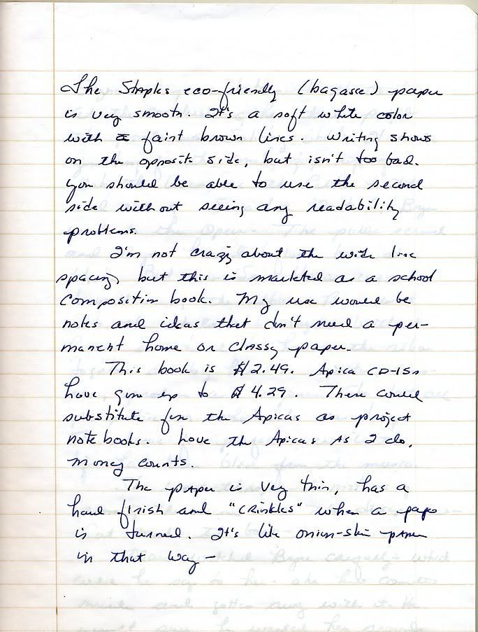
Paper: The paper is thin, almost airmail weight, with an extremely smooth surface. It’s a soft white paper with light brown lines. Staples eco-easy products are made with environmentally friendly vegetable inks, which is nice, although I never thought ink was an environmental hazard.
 Pen and Ink Test: I tested the paper with two pens I use frequently and several inks: a Waterman Carene with a medium-fine cursive italic nib and Private Reserve Midnight Blues ink; a Waterman Charleston with a medium nib, loaded with Mont Blanc black; the Carene again with Waterman Havana Brown and South Sea Blue ink. Despite the very smooth surface, ink went onto the paper without feathering and dried quickly, perhaps more quickly than on the paper of the Apica A610 journal that I use.
The Carene with Private Reserves Midnight Blues ink is something of a dry writer on most papers. Its performance on the eco-easy composition book paper was outstanding. It was extremely smooth on the paper, leaving a wetter and wider line than normal. Amazing-a $130 pen with a $50 customized nib flees from Rhodia and Apica paperstock to find happiness with a store-brand $2.50 notebook. Life is strange. It’s like hoping your daughter will marry a brain surgeon, and instead she falls in love with a guy named Spike who rides a Harley.
I would talk to them about this odd mismatch, but they’ve just informed me they’re expecting a case of index cards in nine months…
I also tested the Carene with Waterman Havana Brown and South Sea Blue inks. These two flow more freely in the Carene than the Midnight Blues. The Havana Brown looked good on the soft white paper. The color was a paler brown that I get when I use this ink with my Pelikan M250, the line was slightly wider than with the Midnight Blues. I liked the look of it on the paper. The South Sea Blue was wide but too pale. It looked like a Caribbean carnival had come to town. I wrote a page with it and then dumped it from the pen.
The Charleston has a medium nib that’s very broad and bullyish, kind of like our big Maine Coon boy. When this pen writes a line, you notice it. Despite writing such a wet line, ink did not bleed through to the other side of the paper
In all cases, I did not experience a problem with ink bleeding to the other side of the page. There is always some see-through and, with a wet medium nib the see-through is more prominent, but it wasn’t such a problem that it prevented use of both sides of the paper. For my uses of these notebooks, the see-through isn’t a problem.
Line spacing: This surprised me. As I said, I’m not crazy about high-school ruled notebooks, and this is the first time in years I’ve written in a notebook using wide line spacing. After I got used to it, I liked it. I found myself writing larger to take up the line space and, in return, I found myself forming my letters more carefully and clearly. For me, improved handwriting is a bonus.
Summary: For $2.49 you get 200 pages of smooth paper in a well-made composition book that looks adult enough not to be an embarrassment if you’ve moved beyond junior high school. It won’t have the cache of Rhodia or Moleskeine. You won’t use this and pretend you’re Hemingway writing from a sidewalk bistro in Paris, which seems to be the whoopla of Moleskeine’s marketing program. Staples gives you a book of paper you can use freely without counting the costs each time you turn a page. Give it a try. You’ll probably like it, and if you don’t, hand it to the kids. There’s no way you can lose with this composition book.


